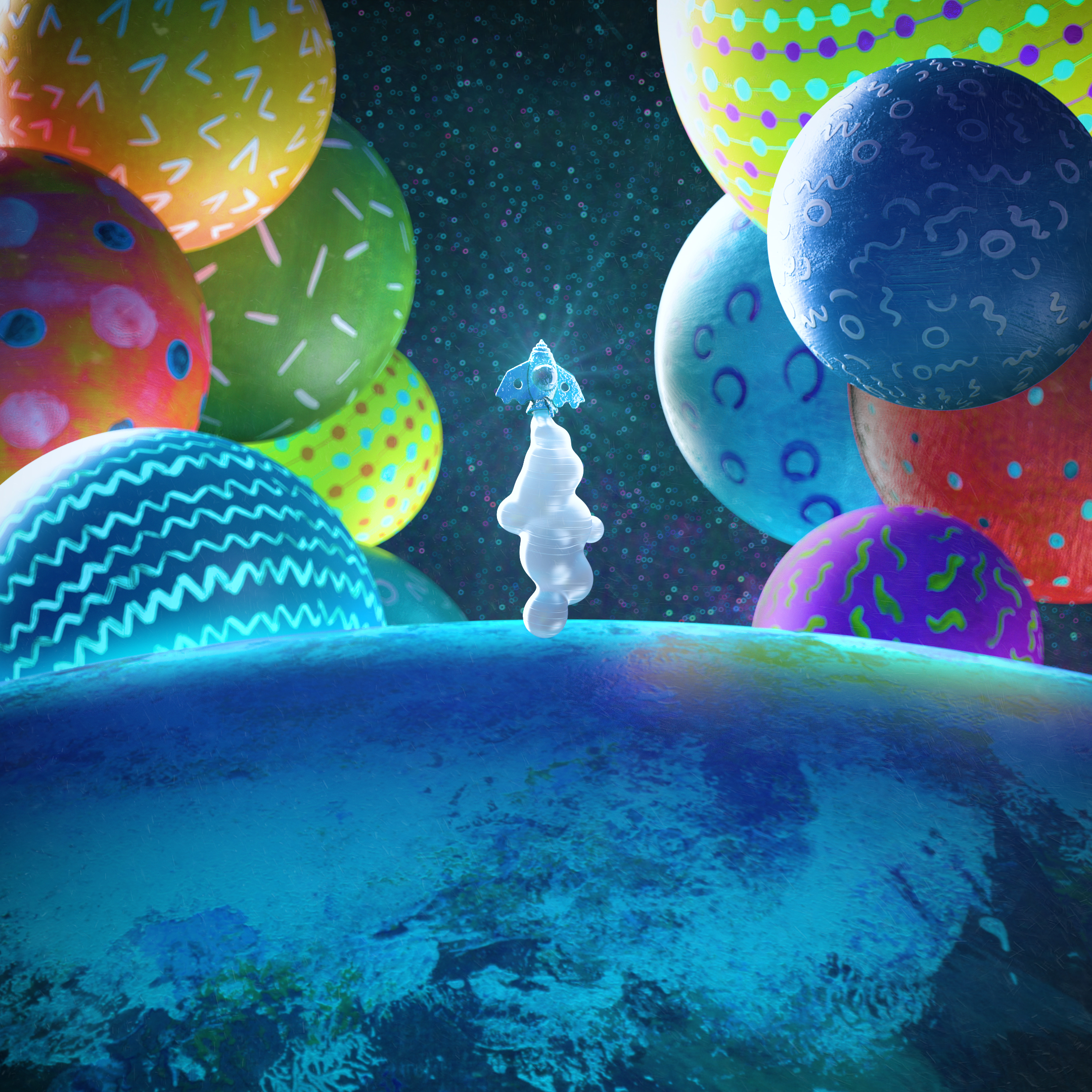
The 36 Days Of Type challenge is always a great opportunity to explore new techniques, styles and push your boundries.
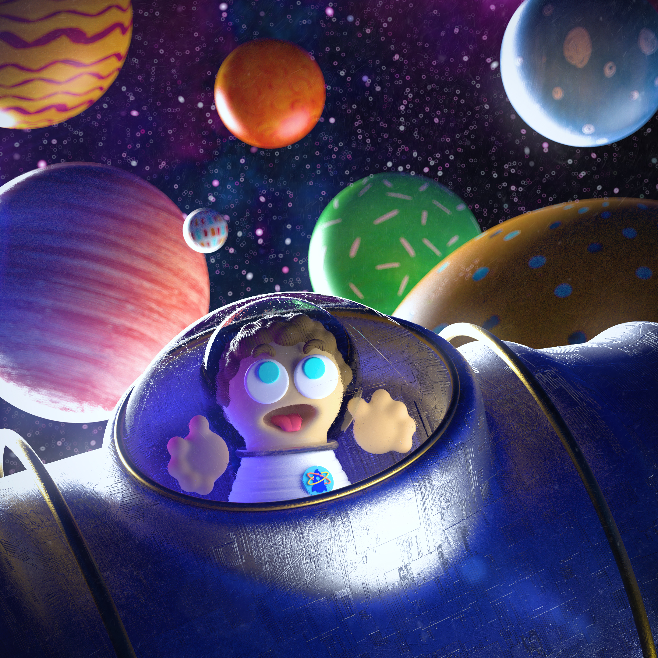
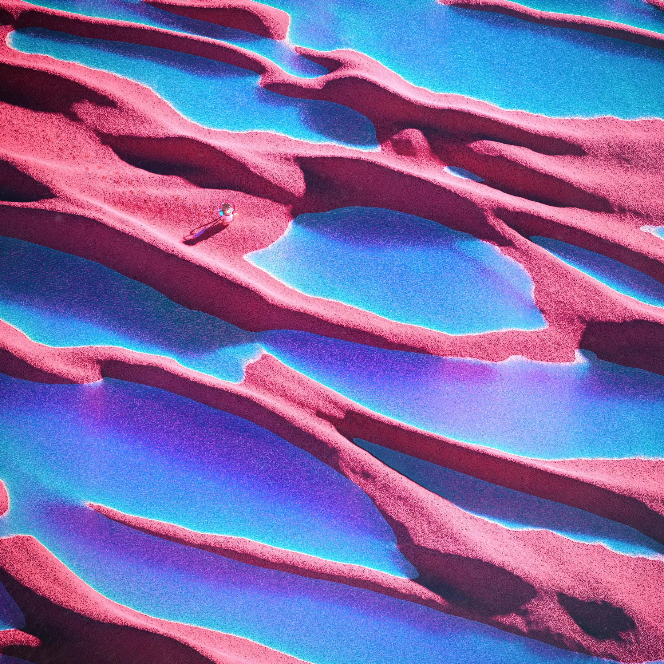
For this edition, we have created the graphic story of Billy S. Pace,
mixing hand-made painture textures, photography and 3D digital art.
Our New Friends
Billy S. Pace
Billy always had dreamed about living a great space adventure.
He had been working hard and preparing for becoming an astronaut since always.
One day, he was ready to start his first spatial journey, that didn’t end up as he had planned…
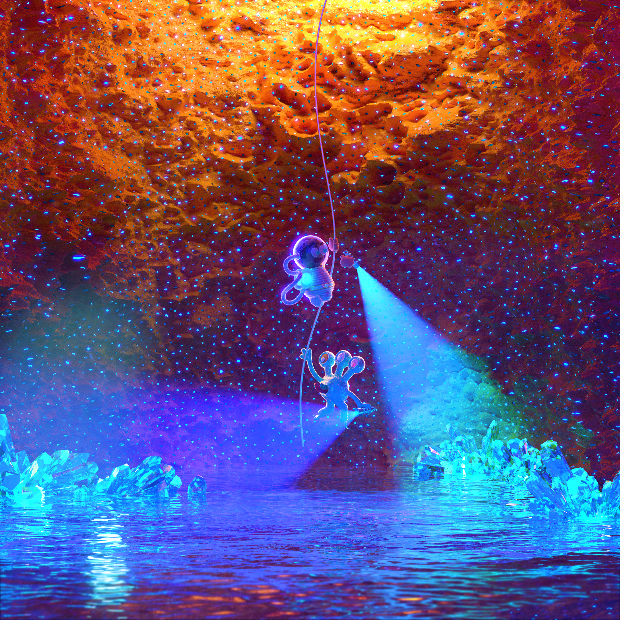
Blu-Blu
Blu-Blu lived alone in the planet Ularus.
His parents left when he was a child, and he grew up in a very hard environment.
Once he was a young Ularunian, he left his planet, looking for the meaning of life…
Close Up’s
The Process
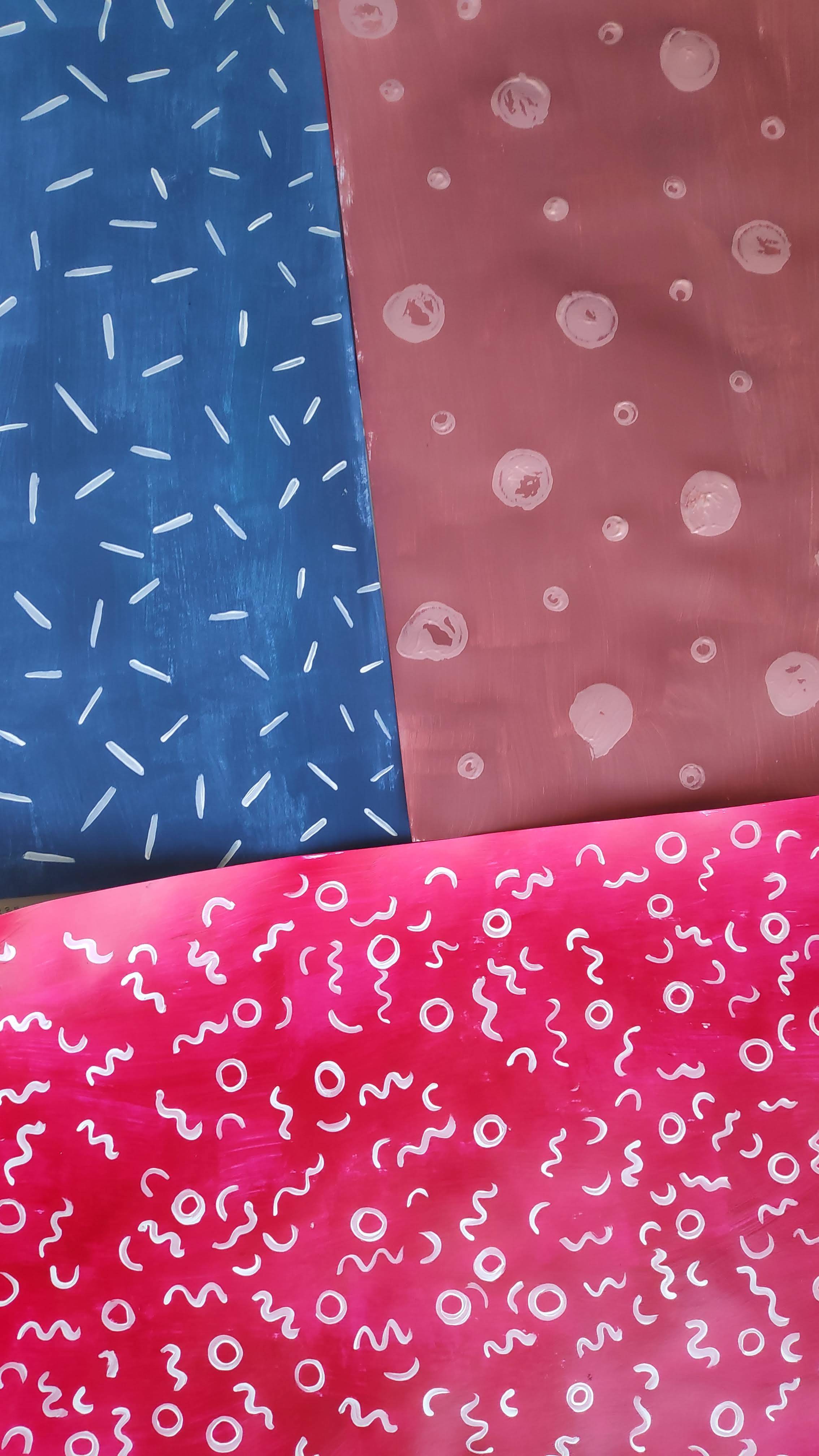
Textures and patterns
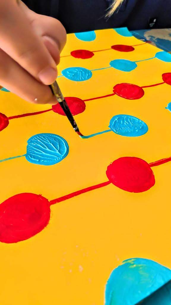
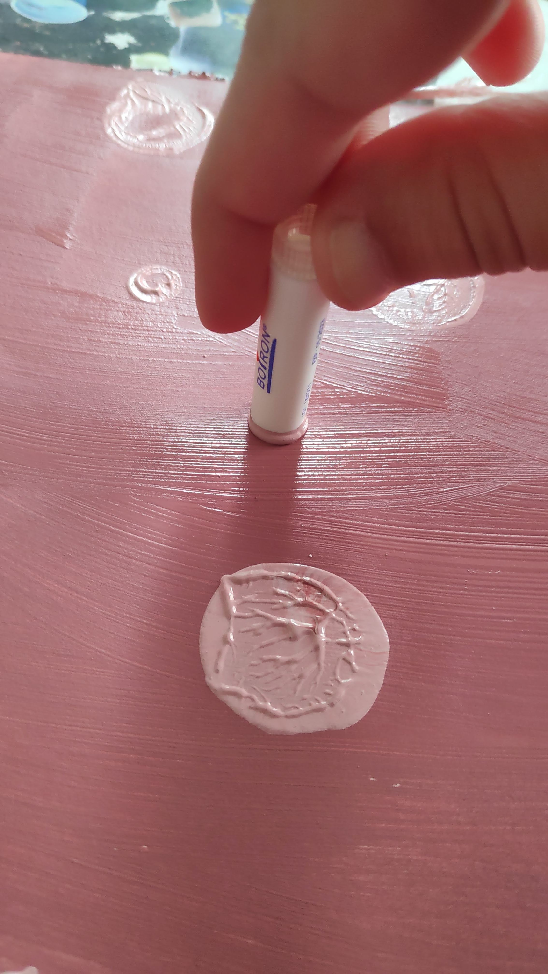
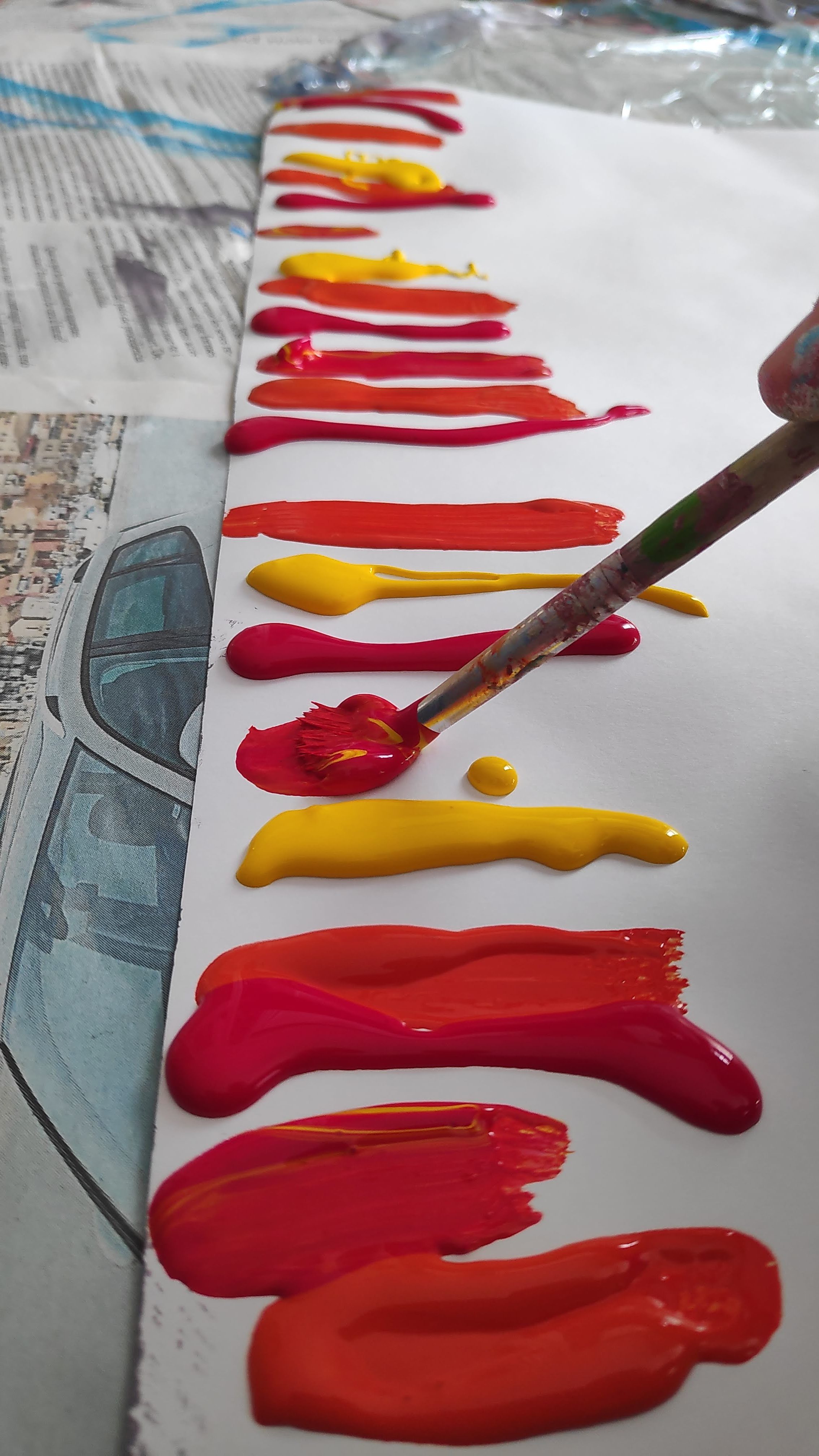
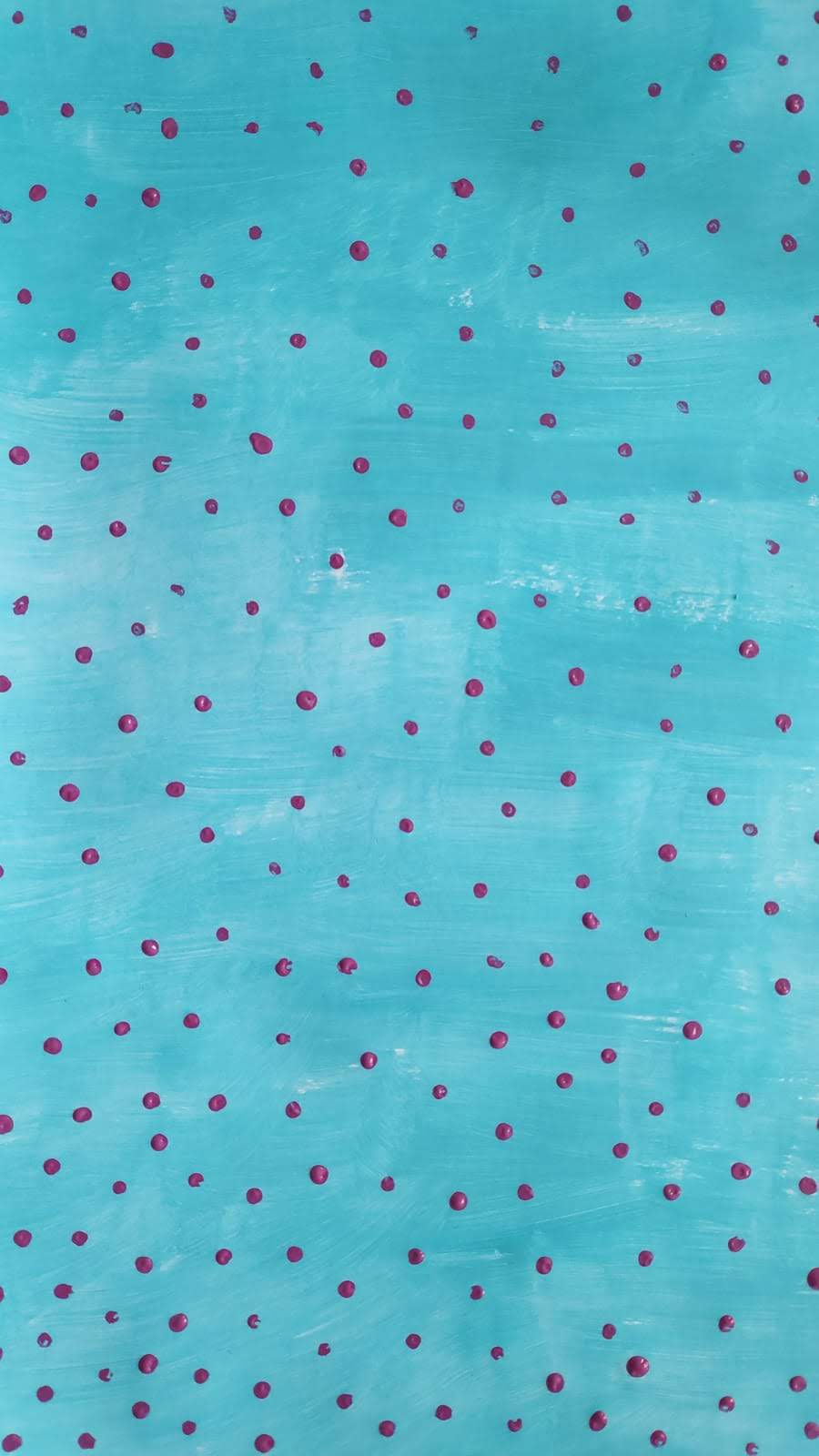
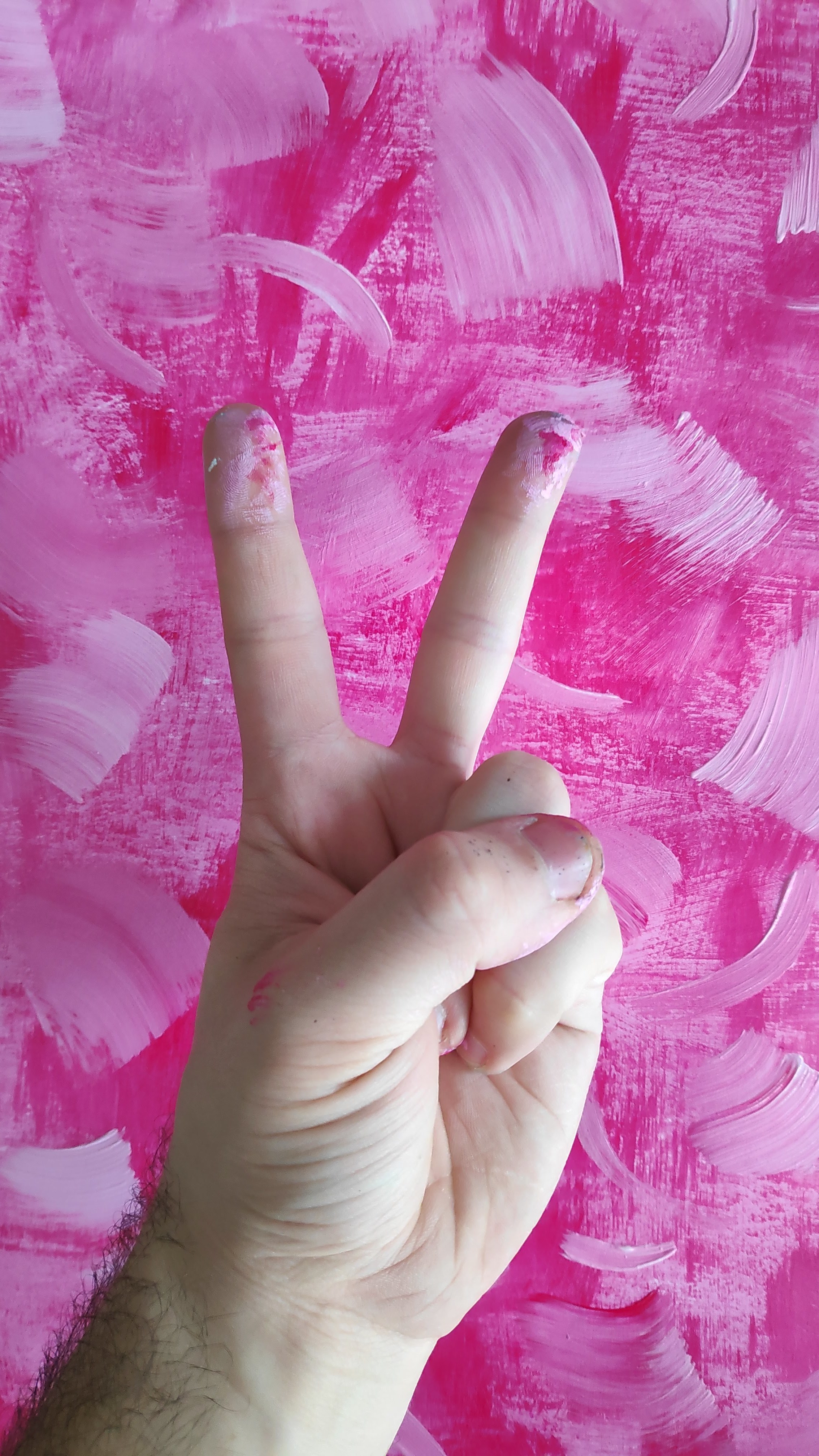
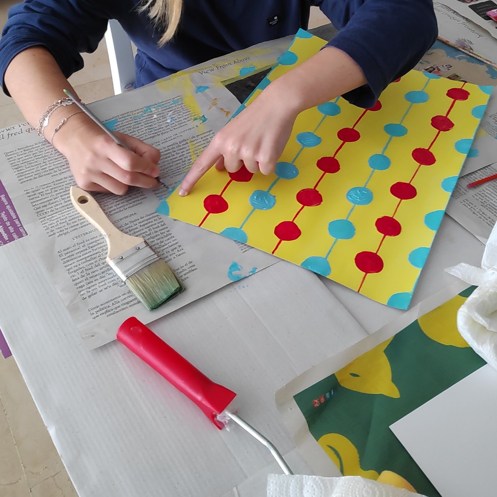
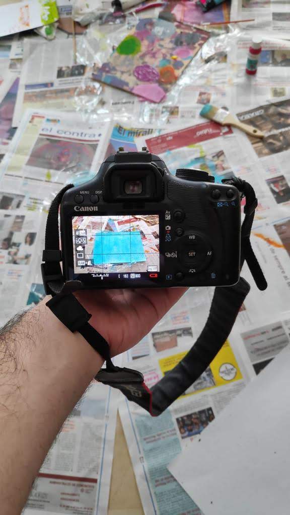
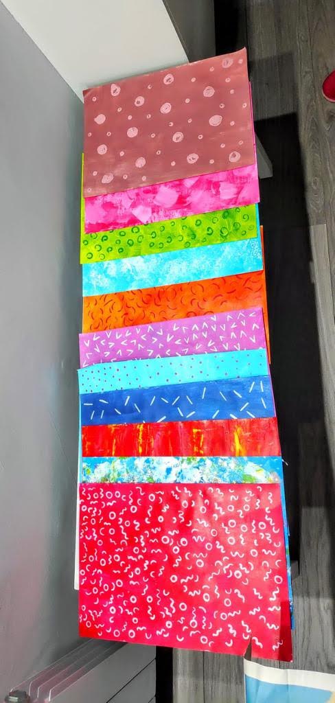
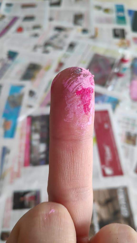
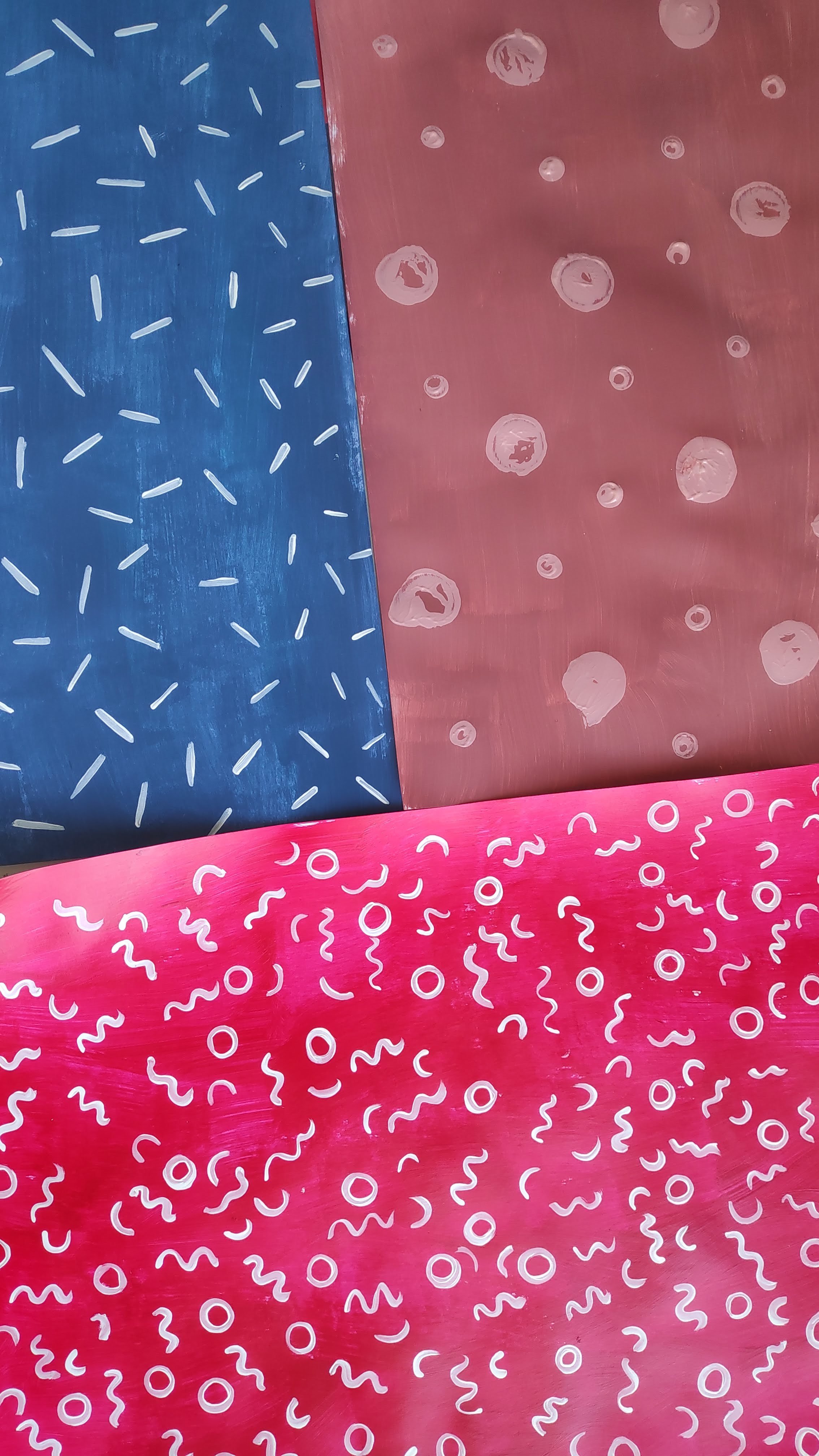
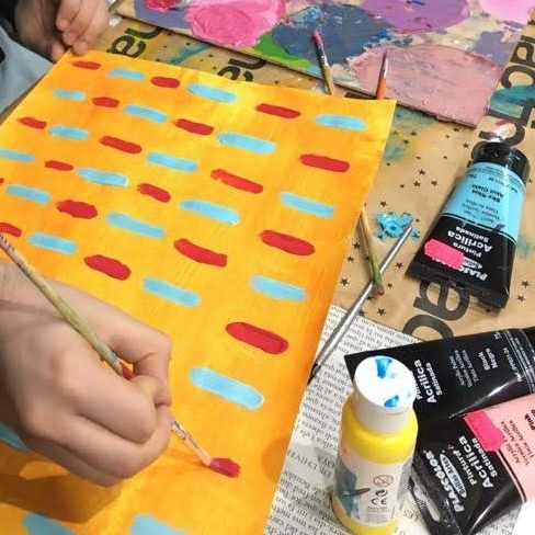
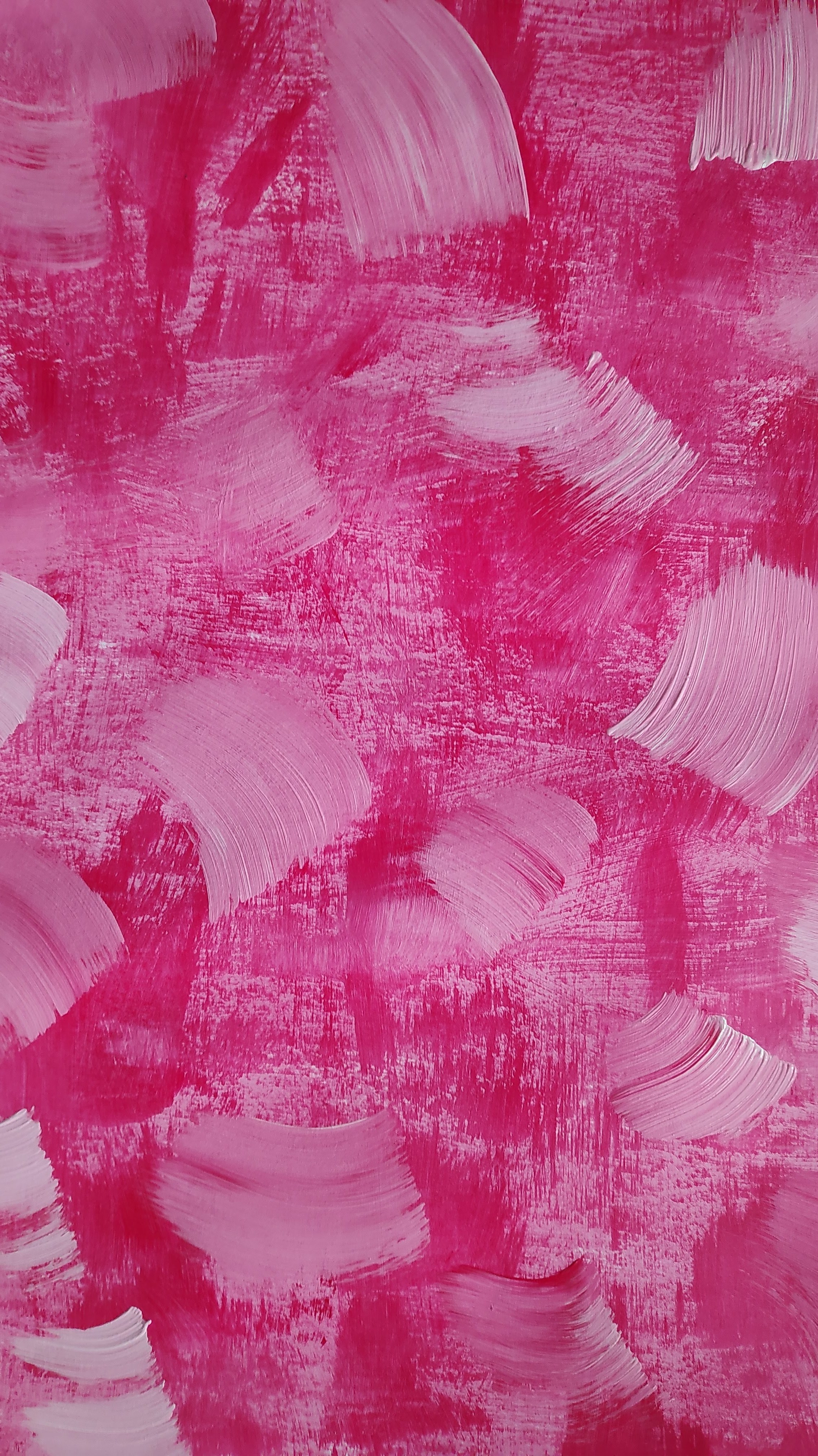
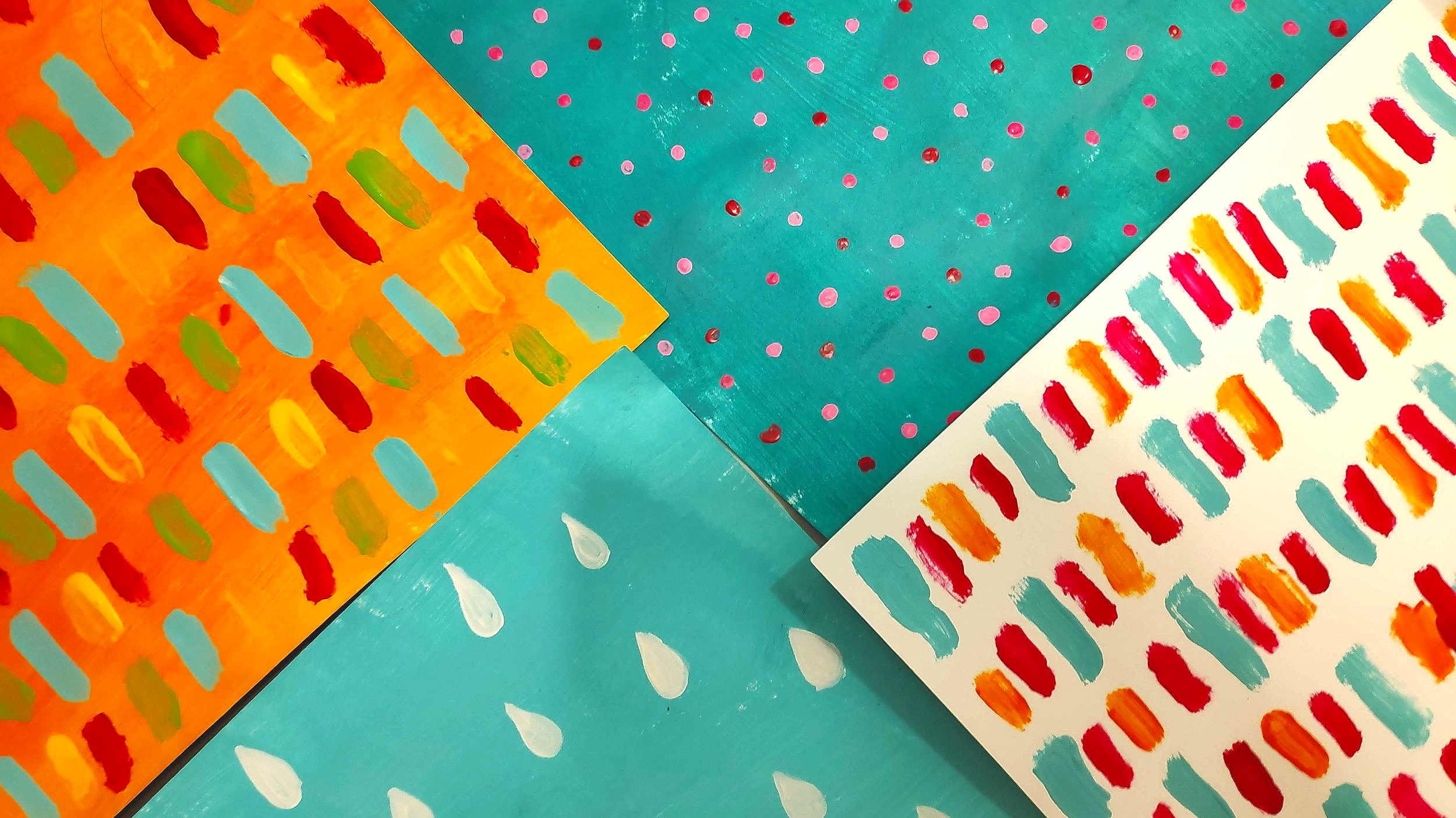
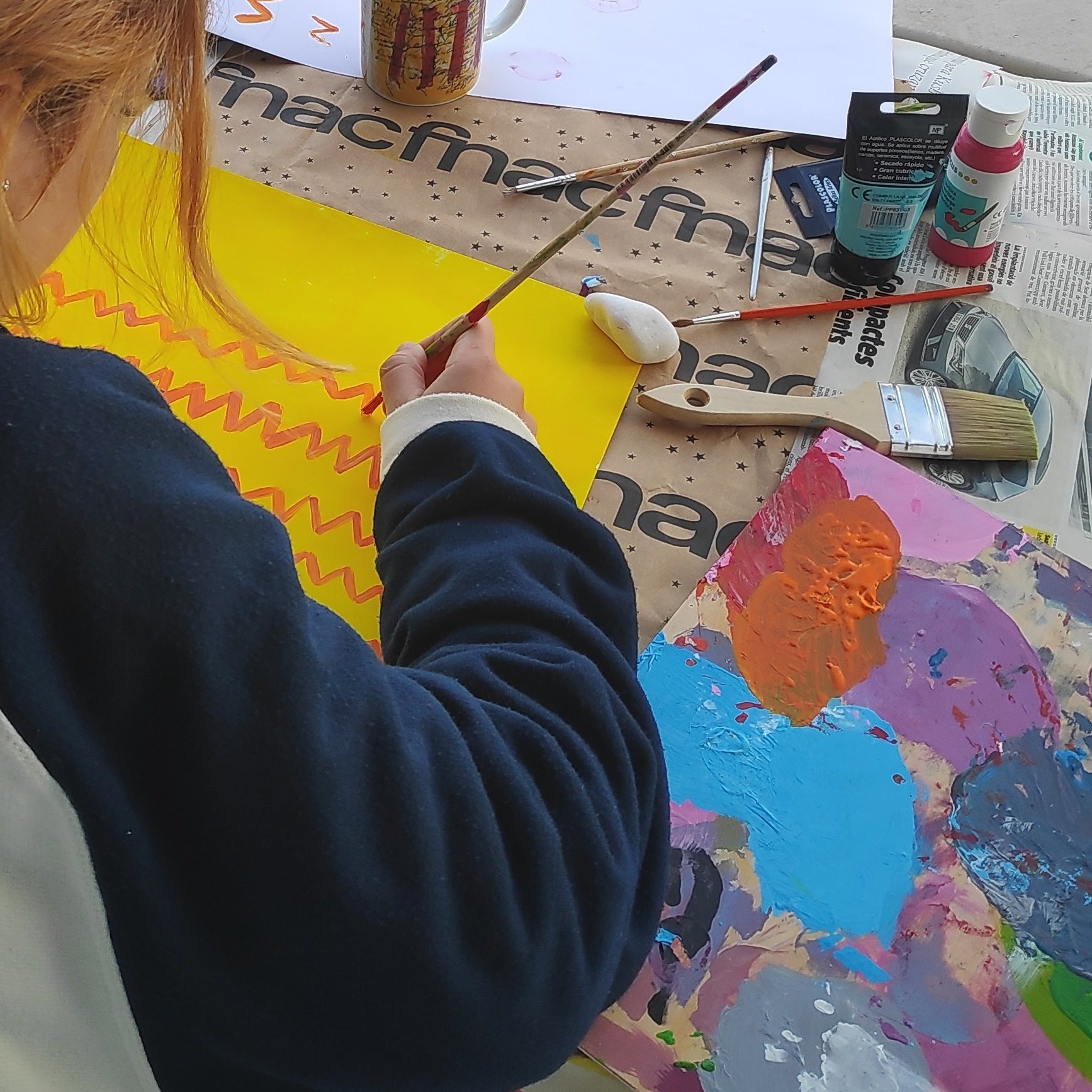
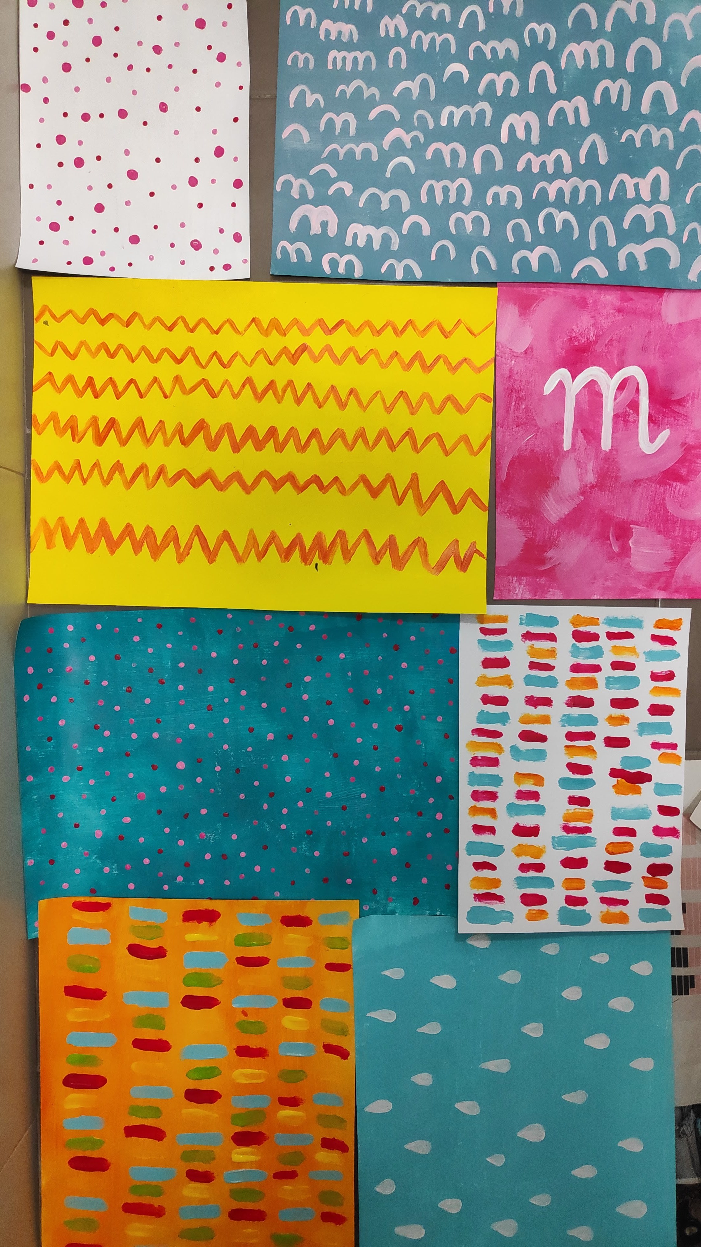
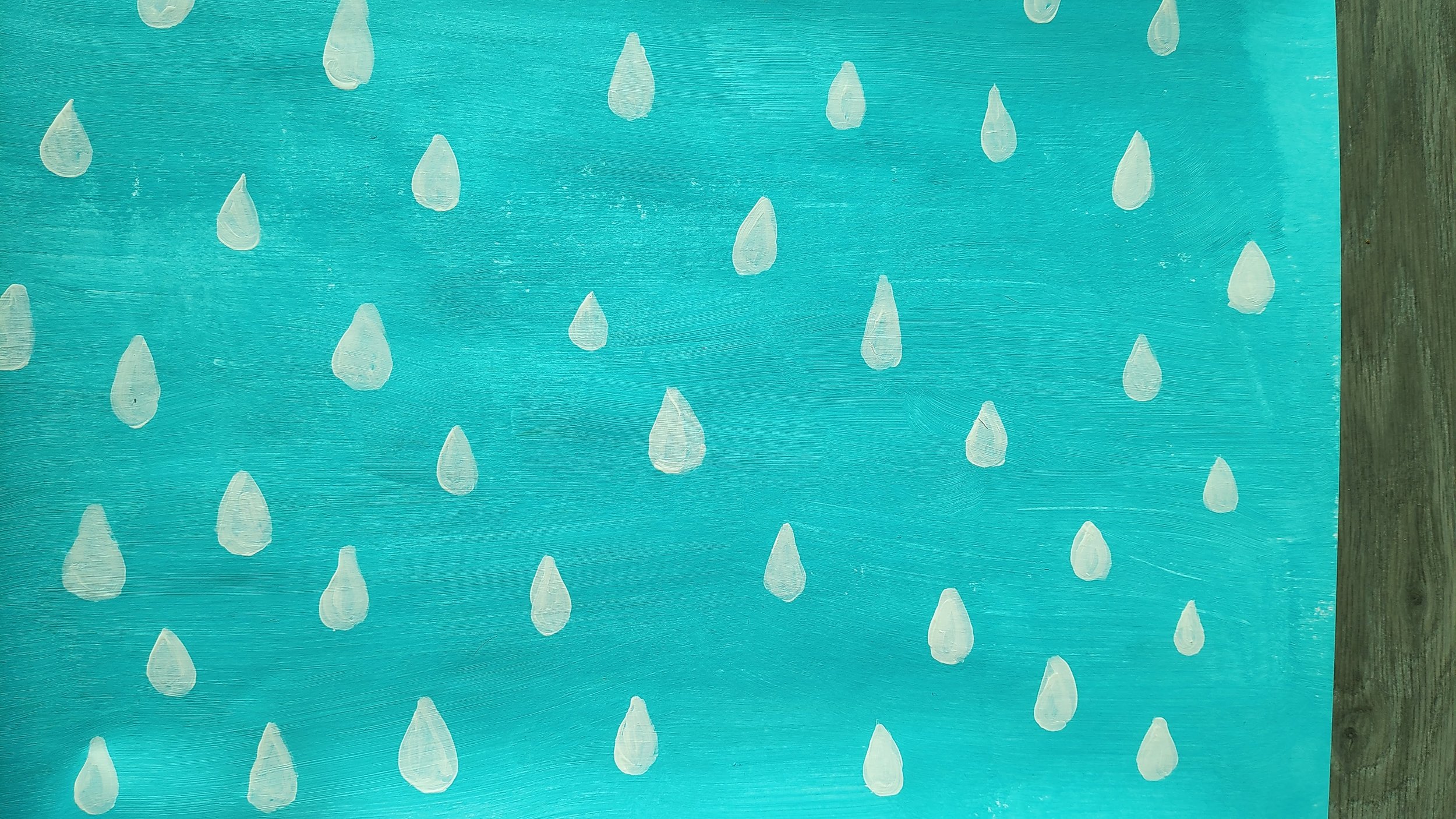
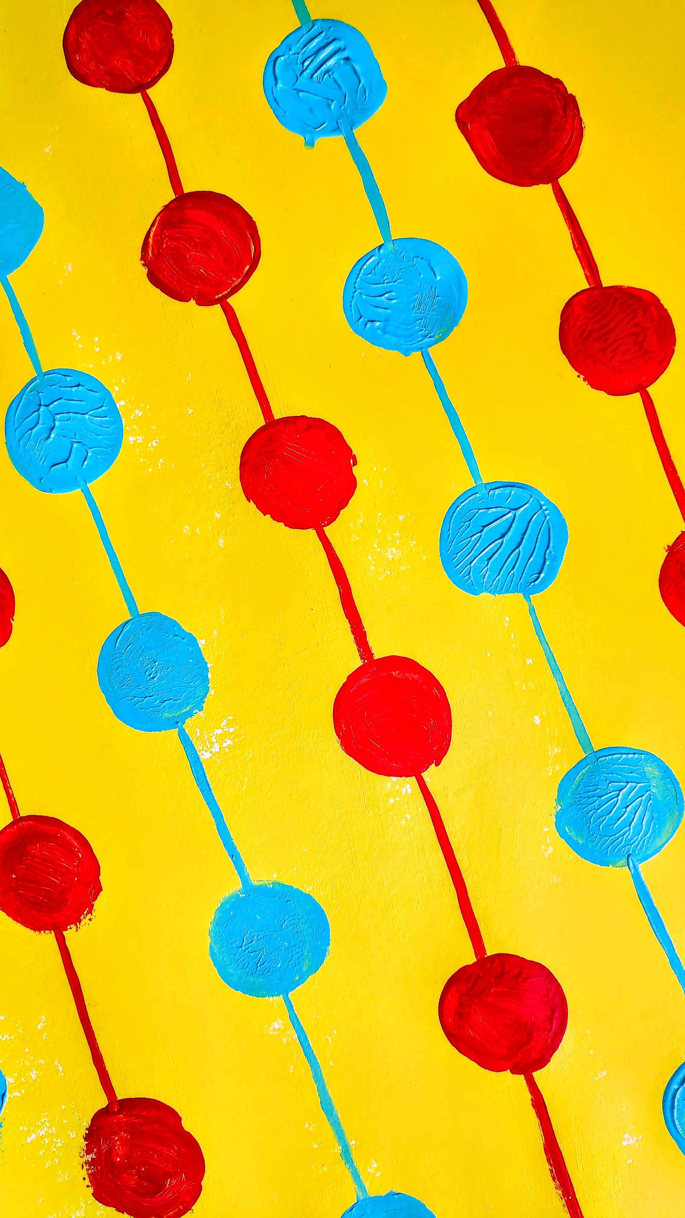
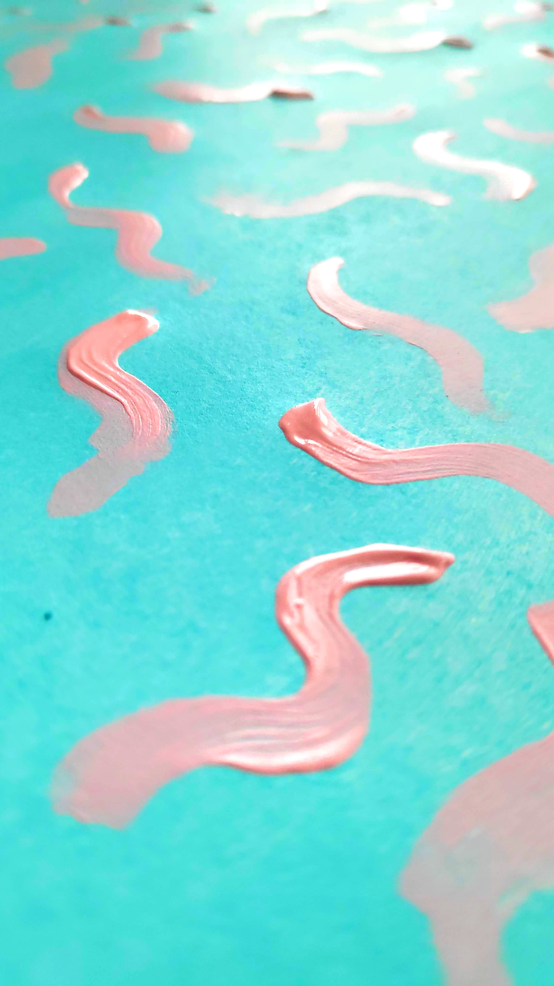
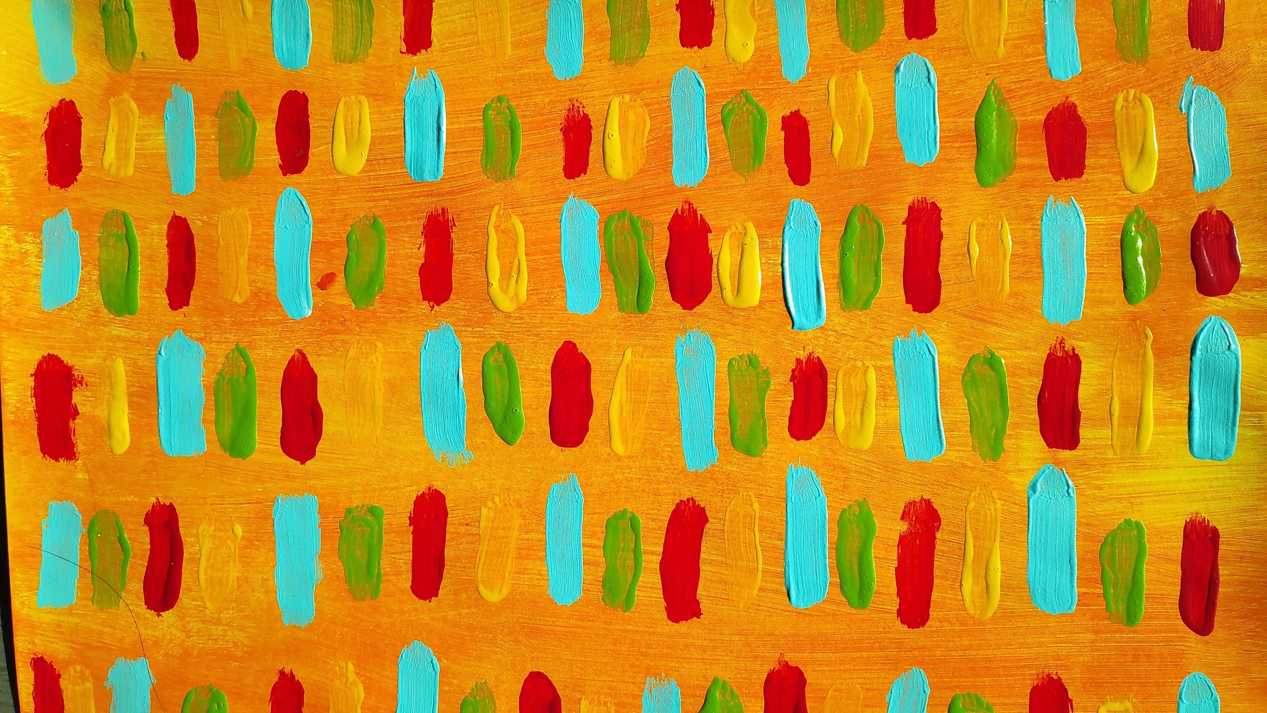
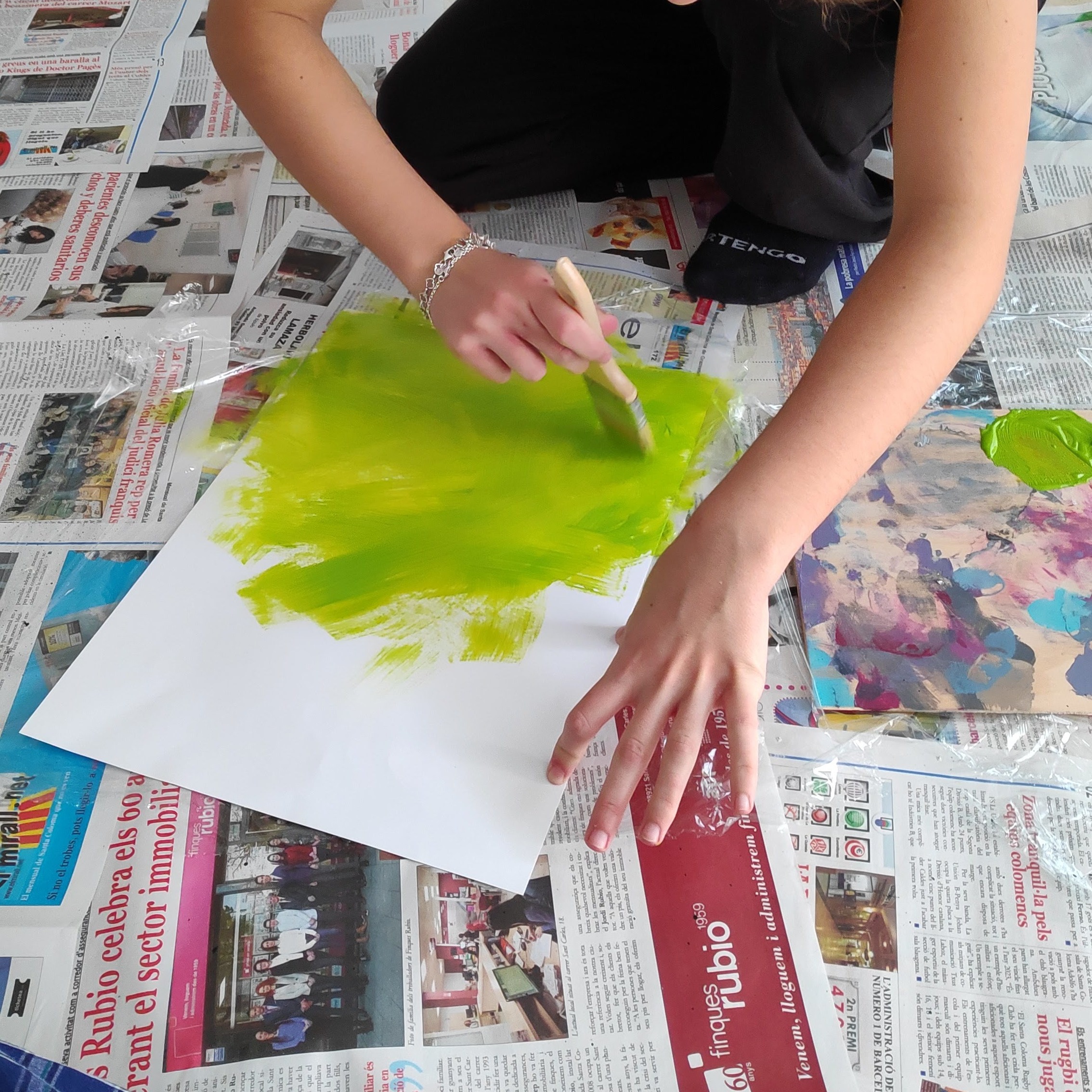
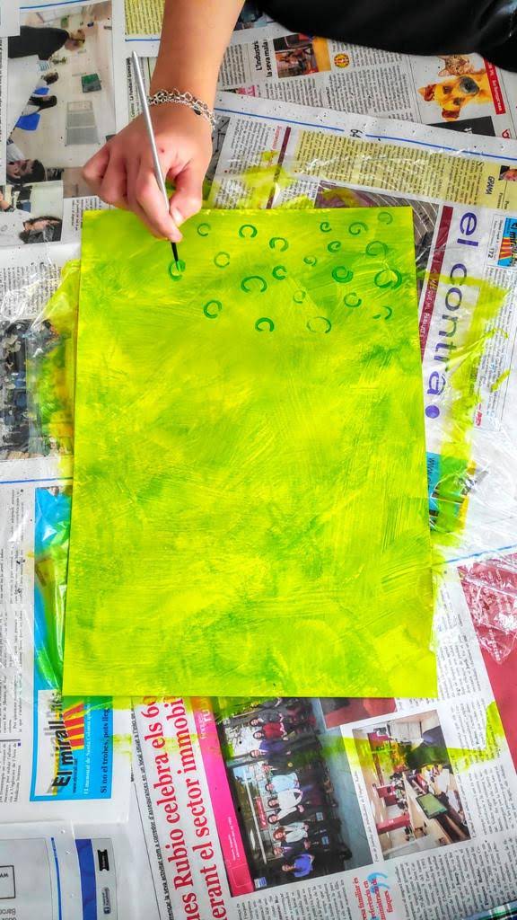
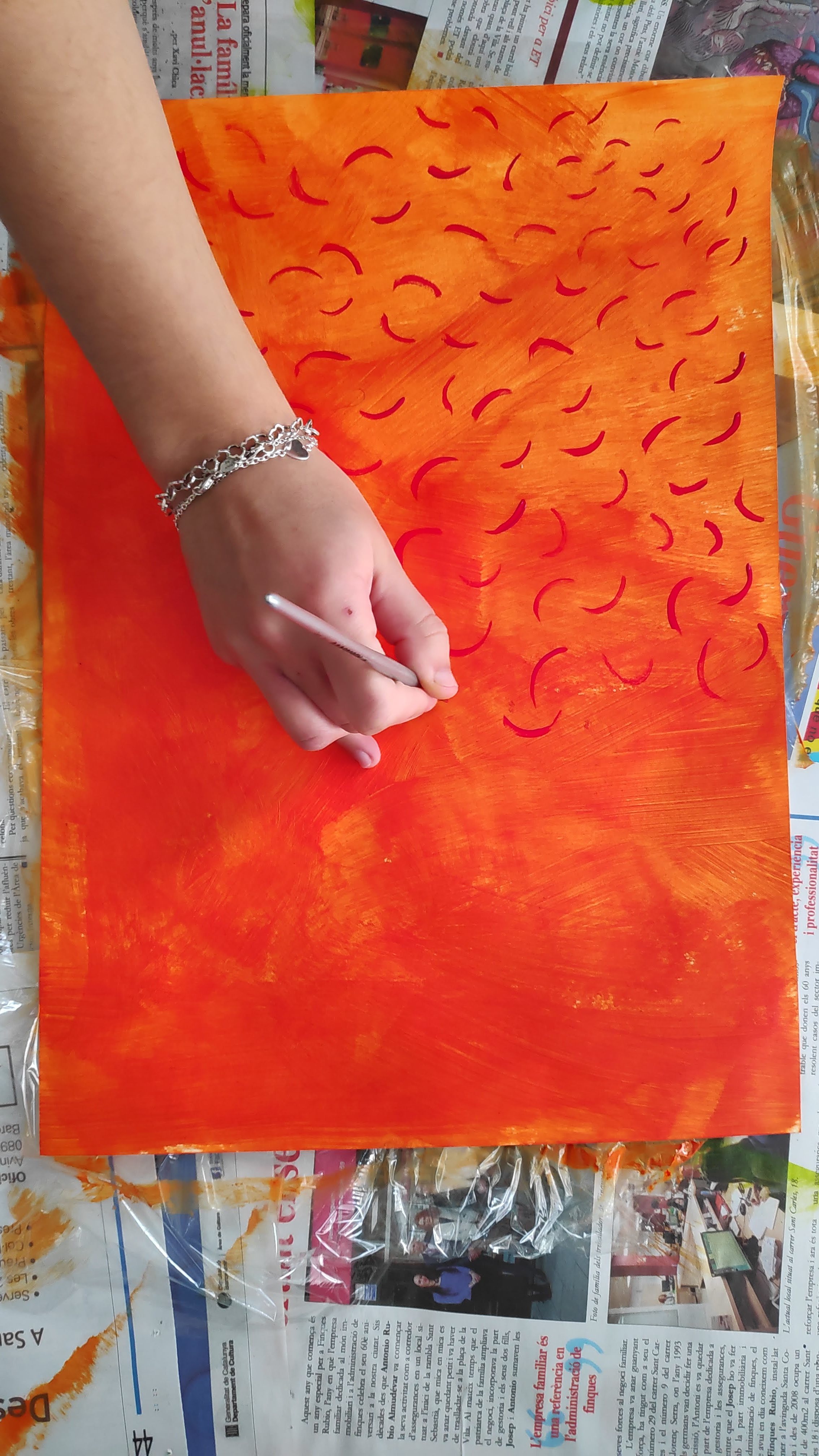
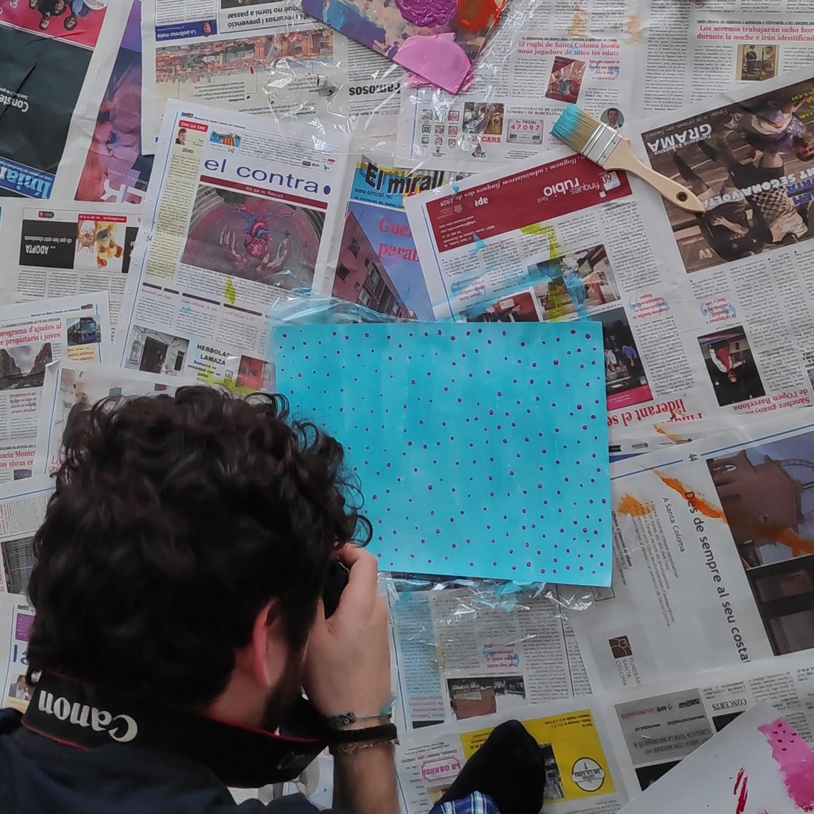
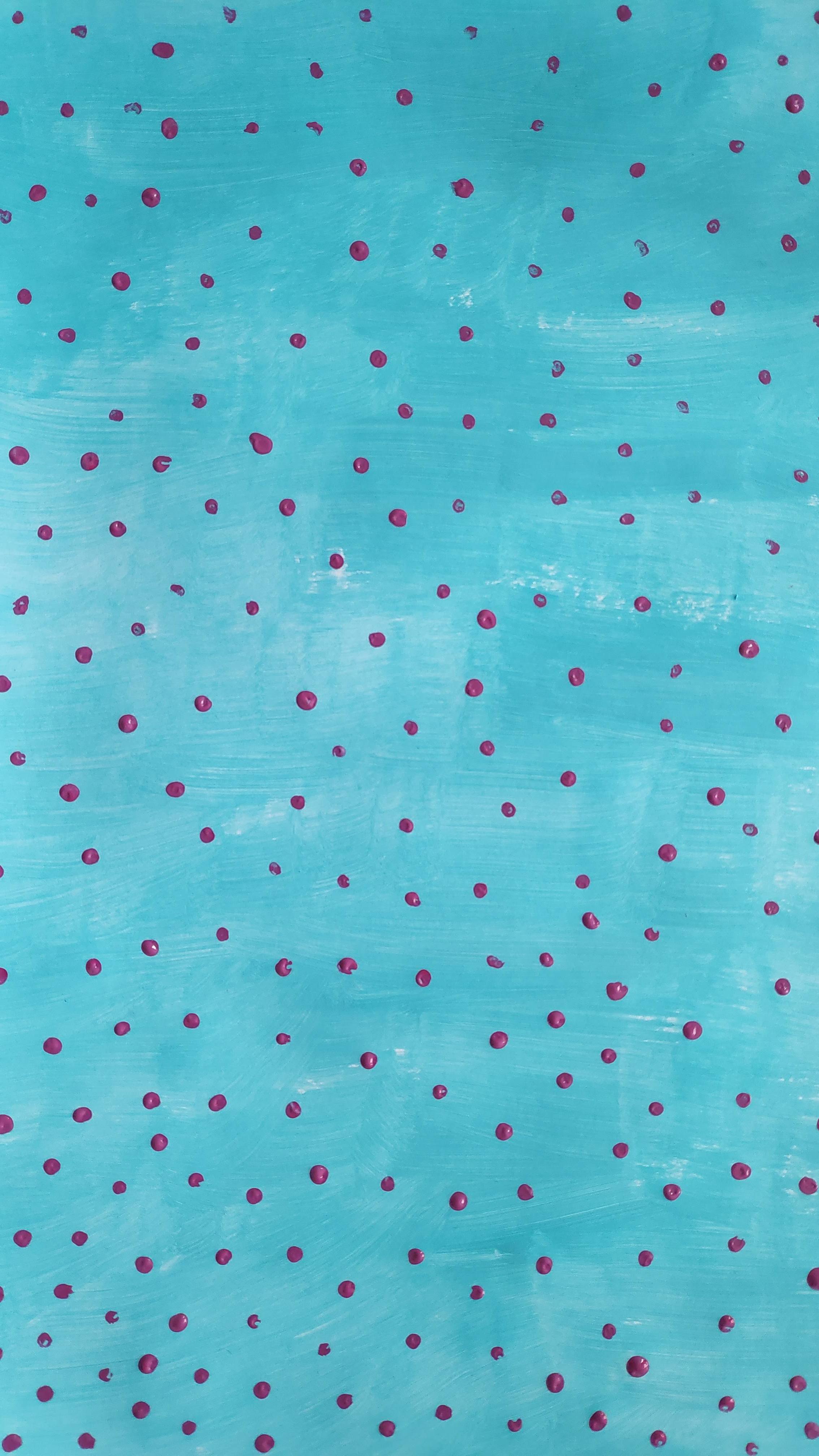
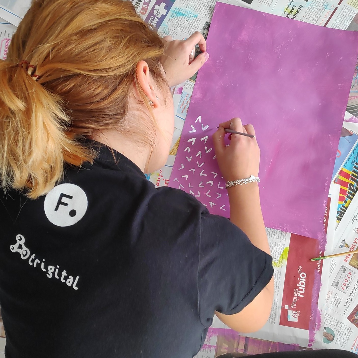
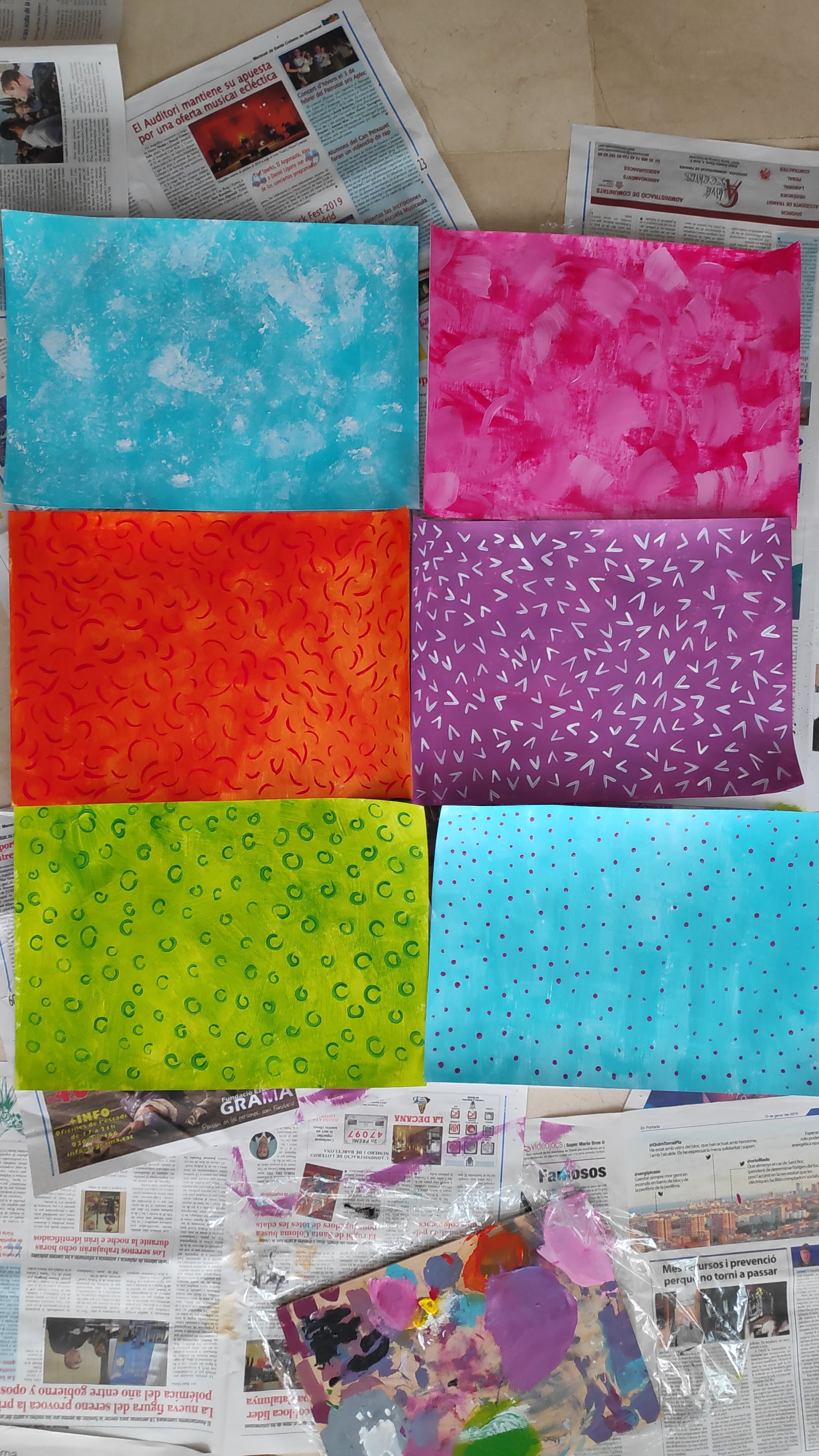
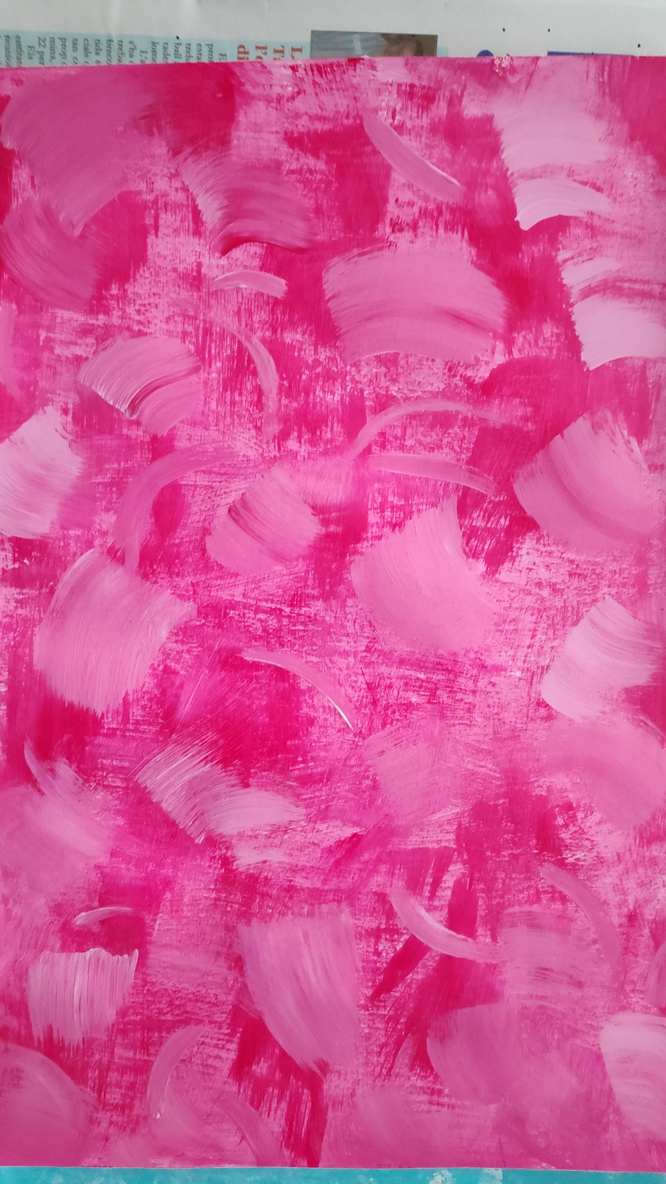
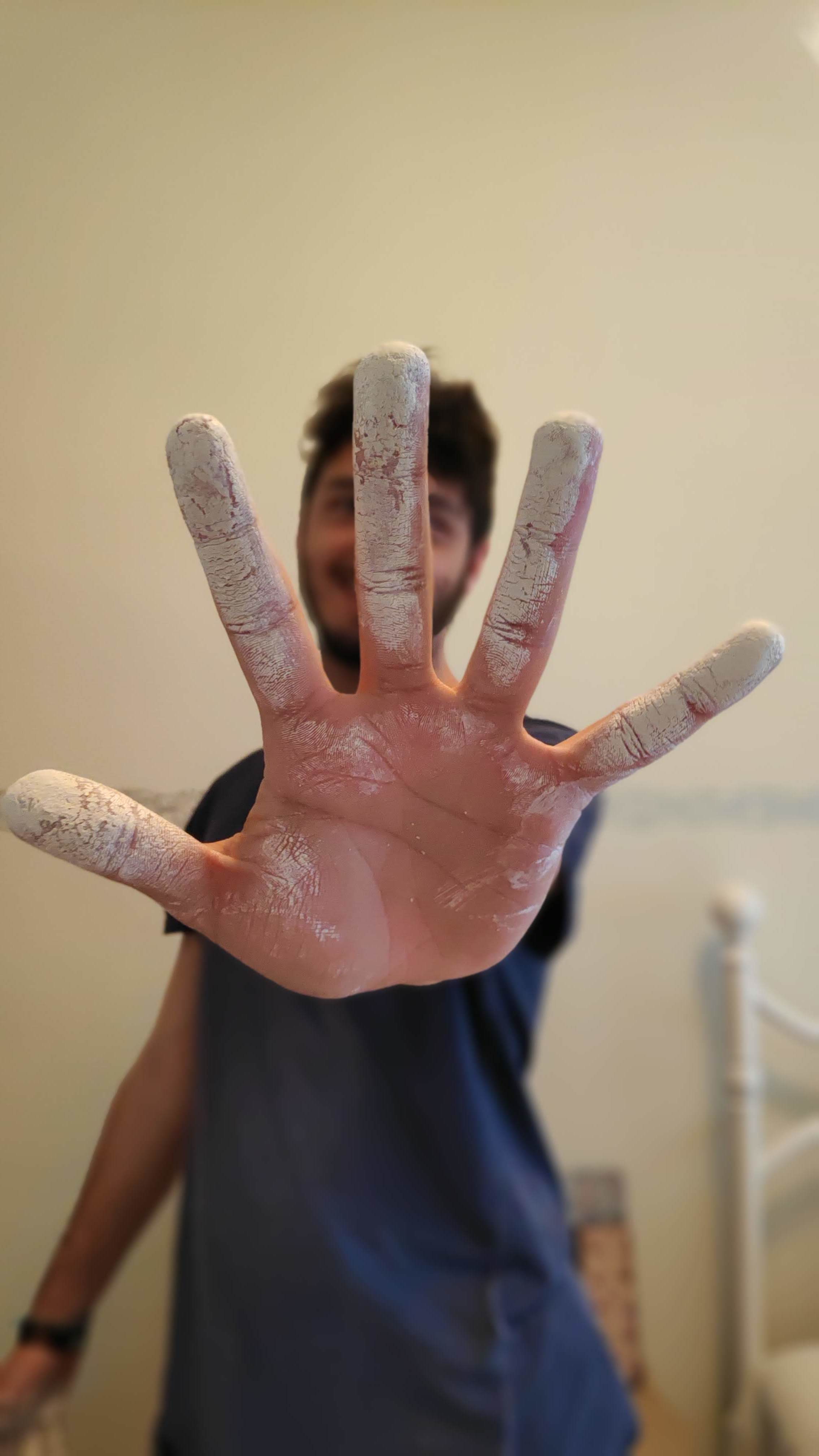
We have explored a new workflow to create this special spatial adventure, based on the handmade painture textures created by the graphic artist Míriam Ruiz García and myself. We have created 26 unique colorful patterns, captured through a digital camera and color-corrected with a digital software. I extracted a Diffuse, Roughness and Bump map for each texture, building a small library of unique textures.
Digital Modelling
All the characters, plants, trees, planets, spaceships and natural environments that appear on the graphic story were made from scratch in Cinema 4D.
We have used different techiniques for modelling the elements of the story, as box modelling, volume modelling, parametric modelling from splines and so on.
The objective was to create a unique and original style, that mixed stylized shapes and shaders with reality.
This mix style was always very interesting for me and I wanted to explore it in a deeper sense with this project.
Shading and Composition of the Scenes
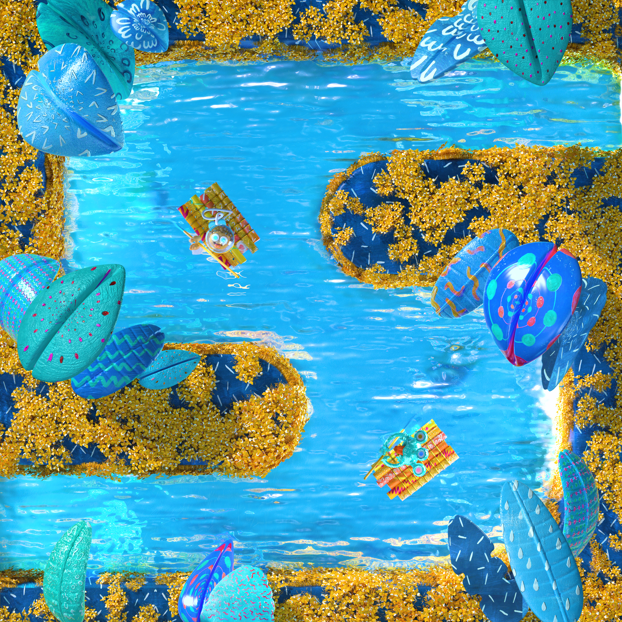
Here is the stage where we started to mix our unique handmade textures and the digital models that we have created.
It was very important for us to maintain the “handmade” feeling on the digital assets, so we have boosted the imperfections of the textures to add a tactile and artisan feeling to them. We were looking for a colorful and varied color palette through the different scenes, so each texture was recycled changing the color, size or roughness to achieve that objective and maintain the visual line of the story.
Regarding the composition of the scenes, we had to distribute the elements in space having in mind the letter of the alphabet that they were conforming. Inside this limitation, the possibilities were limitless, so we have experimented with different camera perspectives and positions to achieve a dynamic flow between each image.
Rendering and post-production
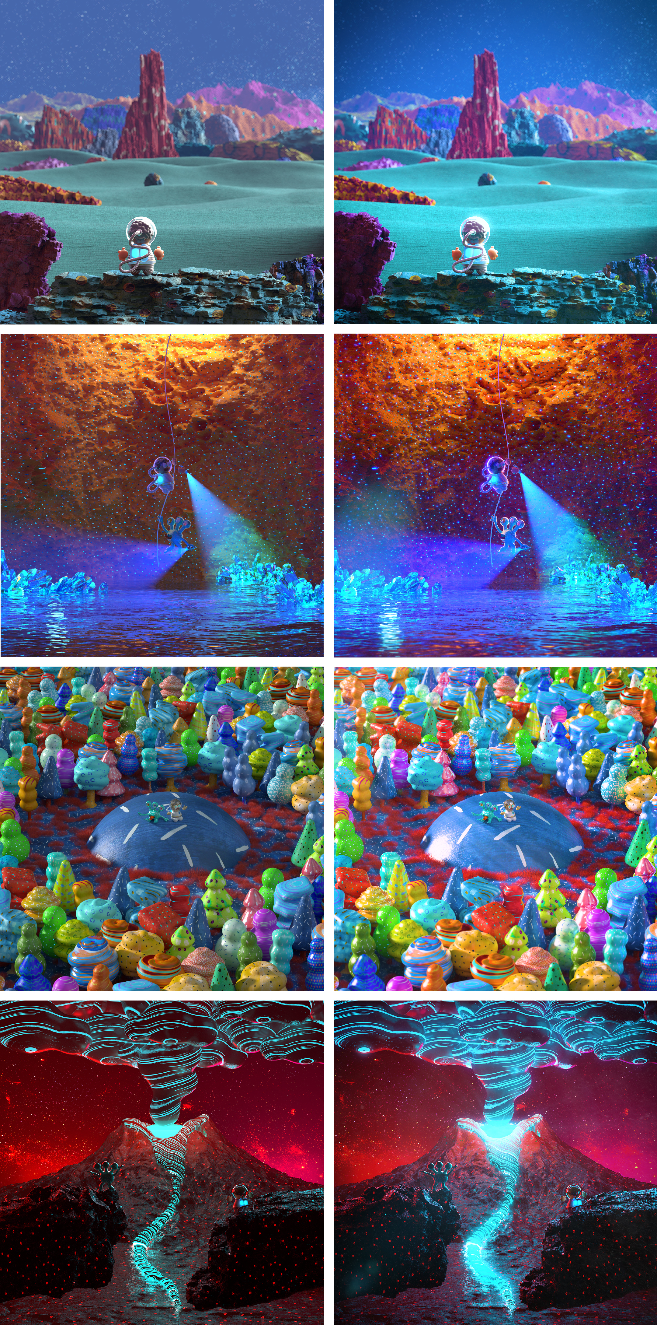
Once the scene was ready to render, we prepared the necessary multi-passes to compose and color-correct them in the post-production stage.
It is always positive for us to re-adjust and correct the images in post to give them the final touch. Here we can see some “before-after” scenes.


